Many entrepreneurs, when starting a business or launching a new product, make the same mistake. They order a logo, receive a beautiful vector image, and believe the design question is resolved. But when it comes to social media design, website development, or printing business cards, the magic disappears. Colors don’t match, the fonts “dance,” and the brand looks inconsistent and cheap.
Why does this happen? Because a logo is just the tip of the iceberg. The foundation of a strong visual image is a well-developed brand identity and corporate style.
In this article, we will explore how brand identity differs from a logo, how it saves your advertising budget, and why design directly influences customer trust.
Logo vs. Brand Identity: What’s the Difference?
Let’s clarify the terminology so we’re speaking the same language.
-
Logo - a graphic mark, emblem, or symbol by which people recognize you. It is the “face” of the company.
-
Corporate Style (Corporate ID) - a set of graphic forms and construction principles united by a single idea.
-
Brand Identity - a broader concept. It is the combination of all elements that form a brand’s image: from visual components (colors, fonts) to semantic ones (tone of voice, philosophy, emotional experience).
Imagine your brand is a person. The logo is their name. Brand identity is their voice, clothing style, posture, and manner of communication. Knowing only the name, you’re unlikely to remember someone in a crowd. But if they wear a bright scarf and speak with a distinctive accent - you’ll recognize them instantly.
What Makes High-Quality Brand Identity?
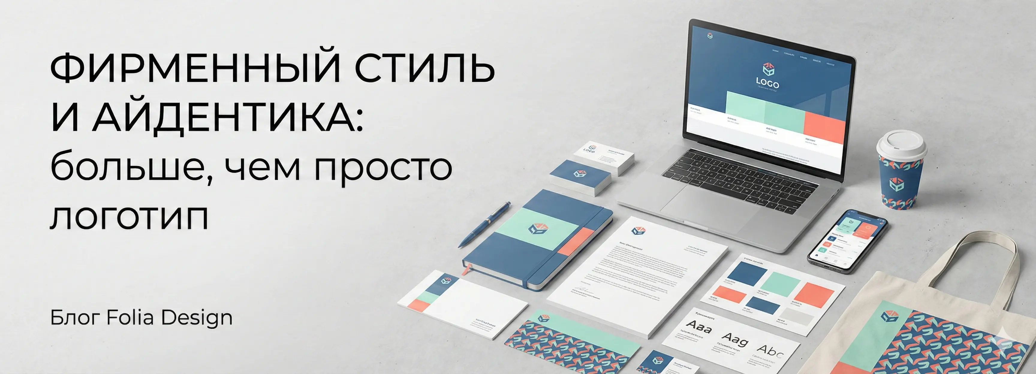
At Folia Design, we create brand identity as a complete system. A functional identity includes the following elements:
1. Color Palette
Color influences perception psychology. Blue evokes trust (that’s why banks love it), orange conveys energy and accessibility, black signals premium quality. In identity development, we define not just “red,” but specific color codes (CMYK, RGB, HEX) so your website and printed materials look consistent.
2. Typography (Font Pairing)
Fonts communicate character. A serif font may imply tradition and reliability, while a modern sans-serif suggests technology and openness. We select a font pair: one for headlines (accent), and another for body text (readable and neutral).
3. Signature Graphics and Patterns
These are patterns, icons, or background elements that scale across any medium. Patterns can appear on packaging, website backgrounds, or corporate merchandise. They create a sense of unity even when the logo is not visible.
4. Photographic Style
Rules for image processing. What filters should be used? Should people look into the camera? Bright colors or muted tones? A consistent photo style makes your Instagram feed and website pages look professional.
Why Should a Business Invest in Brand Identity?
Developing a corporate style is an investment, not an expense. Here are three reasons why it’s profitable:
1. Increased Brand Recognition and Lower Cost per Lead
A client needs 5 to 7 brand touchpoints to remember you. If all channels (website, ads, social media) look consistent, recognition forms faster. This means advertising becomes more effective: users notice familiar colors and are more likely to click.
2. Building Trust
Users form an opinion about a website within the first 3 seconds. Chaotic design subconsciously signals carelessness. “If their website looks like a mess, what will their paperwork or logistics look like?” a customer wonders. High-quality identity shows the company is stable and reliable.
3. Easier Work with Contractors
When you have a Brand Book (style guide), you save dozens of hours and thousands of rubles. You simply send the file to a designer, developer, or printing house. They don’t ask “which font to use” or “which shade of blue is correct.” The result is always predictable.
When Should You Think About Corporate Style?
-
Launching a new business. It’s better to do it right from the start than to redo everything later and lose recognition.
-
Scaling up. You’ve grown beyond a “garage startup” and aim to work with higher-value clients.
-
Website redesign. If you’re updating your website (as we wrote in the previous article), there’s no point trying to stretch an old, weak style onto a new platform.
Conclusion
A logo alone is no longer enough. Competition for user attention is too high. Brands that win are those that build a cohesive, clear, and emotionally resonant identity.
At Folia Design, we don’t just “draw pictures.” We create visual systems that solve business problems and help you sell more.
Ready to transform your brand? Leave a request, and we’ll discuss how identity can strengthen your project.
FAQ: Frequently Asked Questions
Question 1: What will I receive after the brand identity is developed? You will receive a Guideline or a mini brand book - a PDF document with rules for logo usage, the color palette with codes, font pairs, and examples of style applied to various media (business cards, letterheads, social media). We also provide all vector source files.
Question 2: Can I order only a logo and add the rest later? Technically yes, but we don’t recommend it. A logo shouldn’t be created in a vacuum - it needs to function in a real environment (website, signage). When we develop the full identity, we immediately test the logo in different scenarios, protecting you from future redesigns.
Question 3: How long does identity development take? On average, from 2 to 4 weeks. This includes the brief, competitor analysis, development of several concepts, refinement of the selected version, and layout of the style guide.
Question 4: Will the identity work for my website? Absolutely. We are a full-cycle studio. When developing identity, we account for UX/UI requirements from the start. Fonts will be readable on screens, and colors will be web-safe.